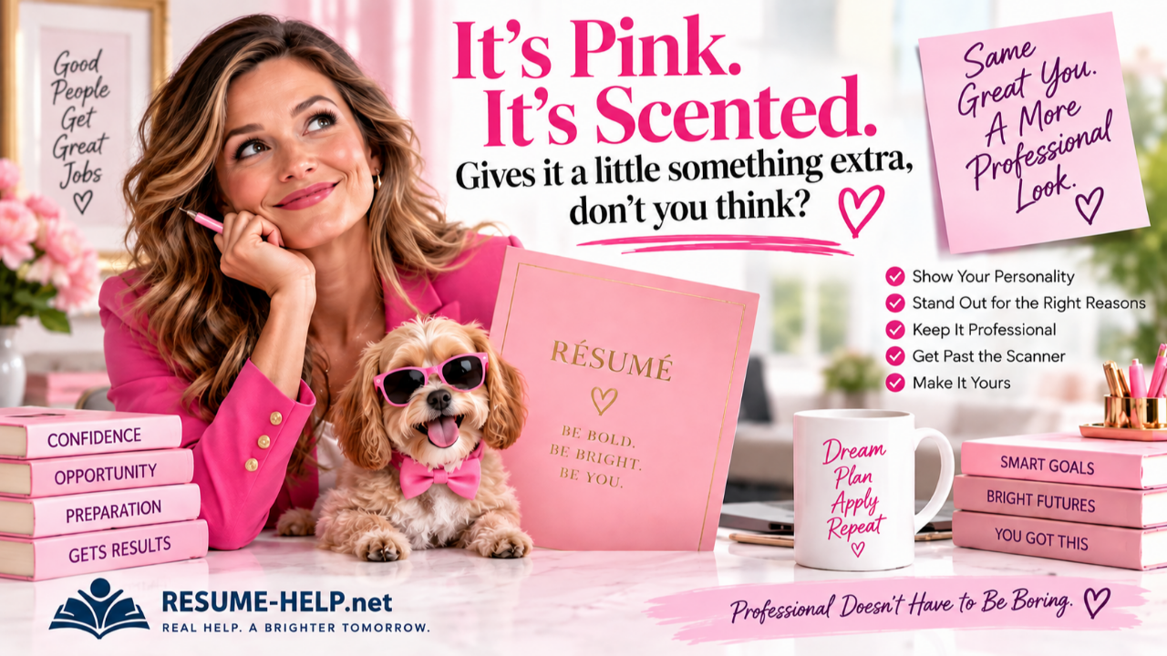
It’s Pink. It’s Scented.
And Your Résumé Can Have a Little Personality Too.
If you've ever seen Legally Blonde, you probably remember the résumé scene. Elle Woods is asked whether she has a résumé. She hands it over, and the recipient looks at it and observes the obvious: “It’s pink.” Elle cheerfully adds that it’s scented and says she thinks it gives it “a little something extra.”
Now, are we suggesting that you perfume your résumé before your next interview? Probably not. But underneath the joke is a surprisingly useful idea: professional doesn’t have to mean boring.
Your résumé can be polished, appropriate, easy to read, and professional without looking exactly like everyone else's. A little color, thoughtful formatting, or a design that fits your personality can help your résumé feel more like you. The important thing is getting the order right: first make the résumé strong, and then make it beautiful.
First, Make Your Résumé Strong
Before you start thinking about colors, fonts, headers, sidebars, or templates, take care of the part that matters most: what does your résumé actually say?
A beautiful résumé can't compensate for weak content. Your résumé needs to communicate what you've done, what you're good at, how you've contributed, and why your experience could matter to the employer you're trying to reach. That's why the RESUME-HELP.net tools focus first on helping you build the content itself.
If you haven't already, create your base résumé. Then take another look at it and ask whether you're missing accomplishments, results, responsibilities, strengths, or skills that an employer would want to know about. If you're applying for a particular position, tailor the résumé so your most relevant experience is easy to find.
Once you've done that work, you've already tackled the hardest part.
Now you can make it pretty.
Your Résumé Doesn't Have to Be Plain Black and White
There is absolutely nothing wrong with a traditional black-and-white résumé. For some people, some industries, and some positions, it may be exactly the right choice. But it isn't the only professional choice.
A résumé can use a deep blue header, burgundy accents, a soft green sidebar, purple section headings, subtle gray shading, or another carefully chosen color. Some designs are beautifully simple and linear. Others use two columns, shaded areas, distinctive headers, or more contemporary typography.
The goal isn't decoration for decoration's sake. Good design should help organize your information and make the résumé pleasant to read. You want an employer to notice your qualifications—not spend 30 seconds trying to figure out where you hid your work history.
And if you'd like to experiment with color, take a look at our What Does Your Résumé Color Say About You? article. The exact same résumé can create a surprisingly different first impression depending on whether you present it in navy, green, burgundy, purple, orange, charcoal, or another color.
An Easy Way to Give Your Résumé a Professional Design
Once you've built, strengthened, or tailored your résumé using RESUME-HELP.net, you don't necessarily need to become a Word-formatting expert to make it look polished. You can take the content you've already created and use a résumé-building service such as MyPerfectResume to experiment with professional templates, layouts, and colors.
Upload your résumé, browse through the available designs, and see what feels right. Maybe you're classic navy. Maybe you're confident burgundy. Maybe you prefer green, charcoal, purple, or something brighter. And yes, if there's a little Elle Woods in you and you really want pink, there's nothing inherently wrong with that either.
The template is simply the package. Your experience is still the product.
That's an important distinction, because the next part can trip people up.
Be Careful With Those "Helpful" Suggestions
As you move through a résumé builder, it may begin suggesting skills, responsibilities, phrases, or job descriptions that you could add to your résumé. Some of those suggestions may be genuinely useful. You may see one and think, Oh! I really did do that, and I completely forgot about it.
Great. If it's true and it makes your résumé stronger, use it.
The problem comes when you start clicking suggested phrases simply because they're there. If you've already spent time uncovering your actual accomplishments, identifying what makes you valuable, and turning vague job duties into meaningful descriptions of what you really did, don't accidentally replace that work with generic résumé language.
Before adding a suggested phrase, ask yourself four things: Is it true? Is it actually about me? Is it stronger than what I already wrote? Does it make my résumé more specific—or more generic?
If the suggestion accurately describes your experience and genuinely improves the résumé, keep it. But if it sounds like something that could appear on 10,000 other résumés, your personalized version is probably stronger.
That's the rule worth remembering:
Use the template. Keep your story.
Pretty Isn't the Same Thing as ATS-Friendly
Once you've chosen a template and your résumé looks fantastic, there is one more step before you start sending it out into the job-o-sphere.
Test it.
Many employers use applicant tracking systems, commonly called ATS, to process résumé and application information. A résumé can look perfectly organized to you while a résumé parser interprets the layout differently. Columns, sidebars, unusual formatting, or other design elements can sometimes cause information to be extracted in an unexpected order.
That doesn't mean you have to be afraid of attractive résumé designs. It simply means you shouldn't assume that because something looks beautiful on your screen, every system will read it exactly the same way.
Run the finished résumé through a free ATS résumé parser and look at what it actually extracts. Don't focus only on whatever score the tool gives you. Check whether it found your name and contact information, whether your employers are still associated with the correct job titles and dates, whether your accomplishments came through, and whether the sections appear in a sensible order.
Most importantly, look for anything that disappeared or got mixed into the wrong section.
Different parsing tools may interpret the same résumé somewhat differently, which is why testing with more than one can be helpful. If your important information comes through clearly and in the correct order, you can feel much more confident about sending the finished résumé to employers.
Keep Your Word and PDF Versions
When possible, save both a Word (.docx) version and a PDF of your finished résumé. Different employers and application systems may request different file formats, and keeping the editable Word version makes future updates much easier.
Also, don't overwrite your only résumé every time you tailor it for another job. Keep your base résumé and save your tailored versions separately. A simple file name that includes the company and position can save you from wondering three weeks later which version you sent to which employer.
That becomes even more useful once you're applying for several jobs at the same time. Your résumé may look prettier now, but underneath the pretty design, good organization still matters.
You Don't Have to Do Any of This Alone
If you'd like some human help along the way, Employment Centers of The Church of Jesus Christ of Latter-day Saints welcome people who are looking for employment assistance. You don't have to be a member of the Church to receive help.
Resources can vary by location, so ask your nearest Employment Center what's currently available. Depending on the center, you may find help with résumés, job searching, interview preparation, employment resources, and other parts of your job search.
And when you're working from home, the free tools here at RESUME-HELP.net are available to help you build your résumé, make it stronger, tailor it for a particular job, practice interviewing, organize your applications, and work through the other steps in your job search.
Same You. A More Professional Look.
Your résumé doesn't suddenly become stronger because you made the header blue. And it doesn't suddenly become weaker because you decided you love purple—or pink.
The substance still matters most: your experience, accomplishments, skills, results, and the story of what you can bring to your next employer. Once those things are strong, good design can help present them in a polished way that feels a little more like you.
So choose a template. Experiment with the colors. Have a little fun with it. Just remember what Elle's pink résumé can actually teach us:
Professional doesn't have to be boring.
And when you're ready to give the résumé you've already created a more polished look, we've put together a simple guide to help you choose a design, protect the personalized content you've worked so hard to create, and test the finished résumé before you send it.
Ready to Give Your Résumé a Professional Look?
You've already worked on the content. Now learn how to choose a professional design, keep your résumé sounding like you, and make sure the finished file can be read properly before you start applying.
Make My Résumé Look Professional →
