What Does Your Résumé Color Say About You?
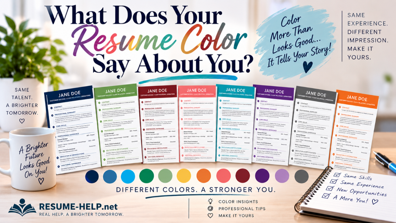
For years, the standard résumé formula was simple: black text, white paper, conservative font, and absolutely nothing that might look too creative.
That approach still works. There is nothing wrong with a clean black-and-white résumé.
But today, job seekers have more freedom to let a little personality show through—and one of the simplest ways to do that is with color.
A deep blue header. A thin burgundy line. A soft green accent. A small touch of orange around section headings.
Used thoughtfully, color can make a résumé feel polished, distinctive, and more like you without turning it into an art project.
So if you could choose a color for your résumé, what would you choose?
And what might that color communicate?
Before You Add Color, Remember What a Résumé Is Supposed to Do
A résumé isn't a poster. Its first job is still to communicate your qualifications clearly and quickly.
A hiring manager should be able to find your experience, skills, education, accomplishments, and contact information without hunting for them. And because many employers use applicant tracking systems (ATS) to process résumés, design should never come at the expense of readable, well-organized content.
That's why a little color can often be more effective than a lot.
Think accent, not rainbow.
You might use color in your name and header, section headings, dividing lines, or a narrow design element along the side of the page. The majority of the résumé can remain simple, clean, and easy to read.
The result can still look professional—it just doesn't have to look exactly like everyone else's.
Blue: Trustworthy, Steady and Professional
There's a reason blue shows up so often in business.
Blue is commonly associated with trust, dependability, stability, calm, and confidence. Darker blues can feel particularly established and professional, while brighter blues can feel more energetic and contemporary.
That makes blue an easy résumé color to consider for people working in fields such as business, finance, technology, healthcare, education, public service, operations, management, and customer relations.
A deep navy can communicate quiet confidence. A brighter blue can make the same basic résumé feel fresher and more approachable.
If you're unsure where to begin with résumé color, blue is an excellent place to experiment.
Green: Growth, Balance and Possibility
Green naturally brings to mind growth, renewal, balance, and forward movement.
Depending on the shade, it can also feel reassuring and grounded. A deep forest green feels very different from a bright spring green, while a softer sage can create a calm, understated appearance.
Green may feel especially natural for careers connected with wellness, education, environmental work, hospitality, community service, food, health, or organizations that emphasize growth and development.
But you certainly don't need a "green career" to use green.
Sometimes it's simply the color that makes you feel most like yourself.
Burgundy: Confidence Without Shouting
Red gets attention—but bright red can sometimes be a lot of attention for a résumé.
Burgundy offers another option.
It carries some of red's strength, energy, and confidence but in a deeper, more restrained form. It can feel established, sophisticated, capable, and decisive without overpowering the page.
For someone who wants something warmer and more distinctive than blue but still wants a polished professional appearance, burgundy can be beautiful.
It can work particularly well as a header color paired with small matching accents throughout the résumé.
Purple: Creative, Individual and Confident
Purple has long been associated with creativity, imagination, individuality, and even a little luxury.
A dark, rich purple can still look extremely professional while giving a résumé considerably more personality than traditional navy or charcoal.
That can make purple interesting for people in creative fields, communications, events, beauty, fashion, design, education, nonprofit work, or other roles where individuality and relationship-building matter.
But again, there are no career-color police.
If you're an accountant who loves purple, you are still allowed to have a purple résumé.
Orange: Energetic, Friendly and Optimistic
Orange isn't shy.
It tends to feel energetic, enthusiastic, warm, and approachable. A bright orange can be playful, while a deeper burnt orange can feel confident and sophisticated.
Used sparingly, orange can add quite a bit of personality without making a résumé look unprofessional.
It might appeal to someone in sales, hospitality, customer service, marketing, recreation, training, entrepreneurship, or another people-centered environment.
The key word is sparingly. You probably don't want an entire page screaming orange at the hiring manager.
A strong orange header or a few carefully placed accents may be all you need.
Teal and Turquoise: Fresh, Capable and Contemporary
Teal sits in an interesting place between blue and green.
It can borrow some of blue's sense of trust and some of green's sense of balance and growth, while feeling a little less traditional than either one.
That's one reason teal can work nicely for someone who wants a résumé that feels modern without looking overly trendy.
It can be especially attractive for technology, healthcare, communications, customer success, education, wellness, and creative-professional roles.
A darker teal feels sophisticated. A brighter turquoise feels more energetic.
The shade changes the story.
Gold and Yellow: Optimistic, Warm and Distinctive
Yellow is associated with optimism, energy, warmth, and positivity—but it needs to be handled carefully in résumé design.
Very light yellow can disappear against white. Extremely bright yellow can be difficult to read.
Deeper gold and mustard tones are often easier to use as professional accents. They can bring warmth and distinction to a résumé without sacrificing readability.
Gold can also pair beautifully with charcoal, navy, or other darker neutrals.
If you love yellow, you don't necessarily have to give it up. You may simply need to choose the right shade and use it in the right places.
Coral and Pink: Warm, Approachable and Personal
Pink and coral can range from soft and understated to bold and energetic.
A dusty rose can feel elegant and sophisticated. Coral can feel friendly, contemporary, and energetic. A pale blush can add just a hint of personality without dominating the page.
And no, these colors aren't limited to a particular gender or profession.
Color is personal.
The better question is whether the shade supports the professional impression you want to make and whether it keeps your résumé easy to read.
Charcoal and Gray: Modern Without Much Risk
Maybe you're reading all of this and thinking, I don't want a colorful résumé.
That's perfectly fine.
Charcoal and gray can create visual interest while remaining extremely conservative. They soften the starkness of pure black and can give a résumé a polished, contemporary appearance without calling much attention to the color itself.
For someone working in a very traditional industry—or simply someone who prefers understated design—charcoal can be a great middle ground.
You're still making a design choice. It's just a quieter one.
The Shade Matters as Much as the Color
Here's where résumé color gets particularly interesting.
Two people can both choose blue and end up with résumés that communicate very different impressions.
Navy can feel traditional and authoritative.
Royal blue can feel confident and trustworthy.
Sky blue can feel friendly and open.
The same thing happens with green, purple, red, orange, and nearly every other color.
So don't just ask yourself:
What color do I like?
Also ask:
What shade feels like me—and what impression does it create with the rest of my résumé?
Your Industry Matters, Too
A graphic designer applying to a creative agency has considerably more design freedom than someone applying for a highly traditional legal or financial position.
That doesn't mean traditional industries require black-and-white résumés. It simply means subtlety may be the better choice.
The more conservative the field, the more restrained you may want your color use to be.
And whenever you're applying to a specific company, take a look at its culture. A playful startup, a children's organization, a bank, a construction company, and a luxury hotel may all respond differently to the same visual presentation.
Your résumé should still feel like you, but it should also make sense for where you're hoping to work.
Don't Let Pretty Get in the Way of Practical
This is the big one.
A beautiful résumé that is difficult to read isn't a better résumé.
Neither is a colorful résumé that hides important information inside complicated graphics or makes the text so tiny that someone needs a magnifying glass.
Keep contrast strong. Keep body text readable. Make section headings obvious. Leave enough white space for the page to breathe. And remember that the words on the page—your experience, skills, accomplishments, and qualifications—are still the stars of the show.
Color should help organize and enhance that information.
It shouldn't compete with it.
So...What Does Your Résumé Color Say About You?
Maybe you're dependable navy.
Maybe you're confident burgundy.
Maybe you're creative purple, optimistic orange, grounded green, contemporary teal, cheerful coral, or sophisticated charcoal.
Or maybe you're perfectly happy with classic black and white.
There isn't one "correct" résumé color.
The fun is in realizing that two people can have equally strong qualifications and still present themselves very differently.
Same skills. Same experience. Different impression.
Your résumé tells the story of what you've done and what you can do next.
A little color can simply help make that story feel a little more like you.
