Your Résumé May Look Pretty...
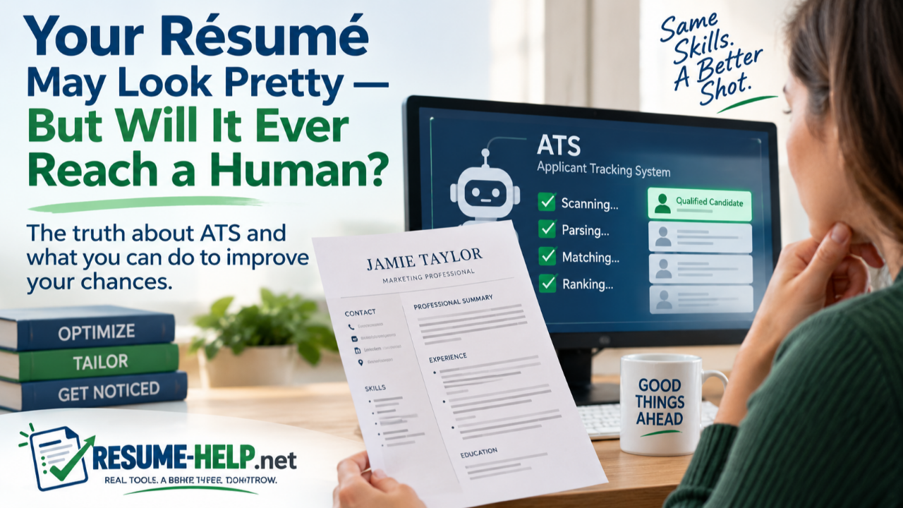
But Will It Ever Reach a Human?
You can spend hours making a résumé look beautiful. The fonts coordinate. The colors are polished. Your skills are arranged neatly in a sidebar. Maybe you have icons beside your phone number and email address, a graphic showing your skill level, or an attractive two-column layout that looks terrific on the screen.
Then you upload it to an employer's application system.
And that beautiful résumé may no longer look quite the way you think it does.
Before a recruiter or hiring manager reviews many online applications, the résumé may first pass through an Applicant Tracking System (ATS). These systems help employers collect, organize, search, and manage applications. As part of that process, résumé information may be parsed—the software attempts to extract information such as your name, contact information, employment history, education, skills, job titles, and dates and put it into fields the system can use.
That doesn't mean a mysterious robot automatically rejects every résumé it doesn't like. Different employers use different systems and different hiring processes. But it does mean that how your résumé is constructed can matter in addition to what it says.
And that's where a résumé that looks wonderful to a human can sometimes run into trouble.
What Does a Résumé Parser Actually See?
You see a page.
A parser sees information it is trying to extract and organize.
Imagine a résumé with a narrow left-hand column containing skills and education and a larger right-hand column containing work experience. To your eyes, the organization may be perfectly obvious. But software has to determine the correct reading order and understand which information belongs together.
Modern systems vary considerably in what they can handle, so it isn't accurate to say that every ATS will fail on every résumé with columns, tables, or design elements. However, complicated formatting increases the possibility that information will be extracted incorrectly, skipped, or read in an unintended order. Indeed advises applicants to avoid complex formatting such as tables, columns, headers, and footers, while résumé-parsing tests have demonstrated problems with elements such as text boxes and multi-column layouts.
That creates an important distinction:
A résumé can look correct without necessarily parsing correctly.
You could have exactly the right experience for a position. But if important information becomes separated from the job where you earned that experience—or isn't extracted at all—the information available inside the employer's system may not represent your résumé as accurately as you intended.
Pretty Isn't the Problem
This doesn't mean your résumé has to be ugly.
An ATS-friendly résumé does not have to look like something typed on a typewriter in 1987.
You can still use professional typography, thoughtful spacing, clear hierarchy, tasteful color, strong section headings, and subtle decorative elements. The important question is whether the information itself remains ordinary, readable text arranged in a logical order.
One useful way to think about it is this:
If every decorative element disappeared, would all of your important résumé information still remain as normal text in a logical top-to-bottom reading order?
If the answer is yes, you're starting from a much safer place.
If your job titles, dates, skills, phone number, education, or accomplishments disappear with the graphics—or depend on text boxes, images, charts, or complicated columns to make sense—that deserves a closer look.
Some of the Prettiest Features Can Be the Riskiest
Résumé design tools make it incredibly easy to create layouts that resemble brochures or infographics. That can be visually impressive, but a résumé submitted through an online application system has a different job to do.
Important information embedded in images or graphics can be difficult or impossible for résumé parsers to extract. Text boxes, tables, multiple columns, unusual symbols, and information placed in headers or footers can also create problems in some systems. Standard section headings such as Professional Summary, Work Experience, Skills, Education, and Certifications are generally easier for software to recognize than creative headings such as “My Journey” or “What I Bring to the Table.”
The same principle applies to contact information. Your phone number and email address may look elegant tucked into a decorative header, but important information is safer when it exists as actual text in the main body of the document rather than depending on a special document layer.
And those little icons that look so attractive beside a phone number, email address, LinkedIn profile, or location? They aren't necessary. Plain text communicates the information perfectly well.
The goal isn't to remove personality from your résumé. It's to make sure design supports your information instead of carrying it.
ATS-Friendly Does Not Mean “Guaranteed to Pass”
This is especially important because the phrase “ATS-friendly” can sound like a guarantee.
It isn't.
There is no single ATS used by every employer. Employers can configure their systems differently, and hiring processes vary. A résumé that parses successfully also isn't automatically a strong match for a particular job.
Formatting is only one part of the equation.
The résumé still needs to accurately show your experience, skills, education, accomplishments, and qualifications. The language should also reflect the position you're actually applying for. Indeed recommends studying the job description and identifying relevant terminology and skills rather than treating one generic résumé as equally appropriate for every position.
And there's an important word in that sentence: accurately.
If a job description repeatedly asks for project management and you've genuinely managed projects, it makes sense to describe that experience using language the employer is likely to recognize. If you've never managed a project, adding “project management” simply because it's a keyword is not résumé optimization. It's misrepresentation.
Tailoring means helping an employer recognize the qualifications you actually have.
It doesn't mean manufacturing qualifications you don't.
Your Résumé Has Two Audiences
This is perhaps the easiest way to understand the whole issue.
Your résumé may need to work for technology first and a human second.
The technology needs to extract and organize the information reliably.
The human needs to be able to scan the document quickly, understand what you've done, see what you're good at, and recognize why you might be worth talking to.
Those goals aren't opposites.
In fact, many of the things that make a résumé easier for software to understand also make it easier for a busy recruiter to read: clear headings, consistent dates, straightforward organization, readable fonts, concise accomplishments, and a logical progression through your experience.
A good résumé doesn't have to choose between readable and beautiful.
It needs to be both—without letting beauty interfere with readability.
What About Word Versus PDF?
This is another area where job seekers encounter conflicting advice.
You'll sometimes hear that an ATS cannot read a PDF. That's too broad. Modern applicant tracking systems commonly handle both Word documents and text-based PDFs, although systems vary and the employer's instructions should always come first. A PDF created from ordinary editable text is also very different from a scanned document or an image-based PDF, where the résumé may effectively be a picture rather than accessible text.
So the simplest rule is:
Follow the employer's file instructions whenever they provide them.
If an employer requests a DOCX file, send DOCX. If the application accepts PDF and your PDF contains real selectable text and retains a sensible reading order, PDF may be appropriate.
What you don't want to do is assume that because the document looks perfect after export, its underlying text is perfect too.
Give Your Résumé a Simple Reality Check
There's a surprisingly easy first test you can perform yourself.
Open your résumé and select the text. Copy it. Then paste it into a plain-text editor.
Now read it.
Did your name come first? Are your job titles attached to the right employers? Did the dates stay where they belong? Did your skills appear? Is your education intact? Are sentences and bullets in a sensible order?
If your beautifully organized résumé turns into a scrambled puzzle when reduced to text, that's a warning that the structure deserves attention before you start sending it everywhere.
This isn't a perfect simulation of every applicant tracking system, but it is a useful basic check of whether your document has a clean underlying reading order. Current résumé-parsing guidance similarly recommends checking the plain-text extraction rather than relying only on what the formatted page looks like.
You can also use an ATS résumé checker or parser to see how another system interprets the document.
Before You Send It...
Your résumé can look perfect on your screen and still be read differently by applicant tracking software.
Before applying, run your finished résumé through a free ATS résumé parser.
You're not just looking for a score. Look at what the parser actually extracted:
✓ Did it find your name and contact information?
✓ Are your employers, job titles, and dates together?
✓ Did all of your experience and accomplishments come through?
✓ Are the sections being read in a sensible order?
✓ Did anything disappear or get mixed into the wrong section?
Different ATS tools may interpret the same résumé somewhat differently. That's why testing your finished file can be so helpful.
- ATS Resume Checker — Free ATS Resume Parser — Shows the text and fields extracted from your résumé. No signup required; its site says parsing happens in your browser.
- Revquix — Free ATS Resume Checker — Shows the extracted text in reading order and flags potential layout problems. No account required.
- Resume Worded — Free Resume Scanner — Provides a free ATS scan plus additional résumé feedback.
Just remember what those tools can—and cannot—tell you.
A scanner can identify potential parsing or formatting problems and may compare your résumé with a particular job description. It cannot promise that every employer's ATS will interpret the document identically, and a high score from a third-party tool does not guarantee an interview.
Use the result as information, not as a magic number you have to chase.
Don't Forget the Most Important Part: The Résumé Itself
It's easy to become so worried about ATS that you start writing your résumé for a machine instead of for the person you ultimately want to reach.
Don't.
The purpose of making your résumé easier to parse is to give your real qualifications a better chance of being understood.
Clear formatting can't compensate for vague experience. Keywords can't replace relevant qualifications. A perfect file format can't turn generic job duties into compelling accomplishments. And no ATS strategy can guarantee that you'll be selected when employers may receive many qualified applications.
Your résumé still needs to tell your story clearly.
What problems did you solve? What did you improve? What responsibility did you carry? What changed because you were there? What skills did you actually use? Which parts of your experience matter most for this particular position?
That's the material a human being ultimately needs to see.
Build for the Machine. Write for the Human.
You don't need to be afraid of applicant tracking systems, and you don't need to strip every bit of personality out of your résumé.
You simply need to respect the fact that your document may be doing more than one job.
It needs a structure technology can interpret. It needs language relevant to the opportunity. It needs to represent your experience truthfully. And when it finally appears in front of a recruiter or hiring manager, it needs to be clear, professional, and easy to read.
So yes—make your résumé attractive.
Use good typography. Give it breathing room. Make important information easy to find. Let it look like someone cared when they created it.
Just don't let the decoration become more sophisticated than the document underneath it.
Because the prettiest résumé in the world can't impress a hiring manager if the information doesn't make it through clearly enough for that hiring manager to see it.
